
Monday, January 30, 2012
Tuesday, January 24, 2012
Just some logos
Logo #2 - BOSE - This logo is also very effective in my opinion, as the company strives to be one of quality and class. The font and use of the lines gives one the sense of class and movement. This shows that the company is always looking ahead and trying to improve. It also makes me feel as though their products are well constructed because of the lack of color, as well as the font. The logo does not seem as though the brand is targeted towards children, because it seems more serious, but it also does not seem as though it is targeted towards a certain gender, and seems quite neutral. The lack of color may also aid the classy finish the company is going for, as they try to look elegant and use a timeless color, black.
Logo #3 - Oakley - This logo is simple yet effective, as everyone can identify it from a mile away. The logo makes me feel as though time is never ending and the moment will last forever. The logo doesn't seem fun, but makes me feel wild and adventurous, as the never ending time gives me the feeling that I am invincible. To me it does not seem kid friendly as it still has a serious feel towards it. I also think the product looks more manly because of its lack of color and fashion that one usually sees in female geared brands. The logo has no real standard color, and the color never gives off a feeling to me, however silver, white, and black always give off the feeling of class and a well constructed product.
Sunday, January 22, 2012
Some Future Companies?
Idea #1: Soul Rebel - fishing company based in Trinidad, focus on creating clothing for persons who enjoy fishing and being on or in the sea.
Idea #2: Butu - Energy Drink brand focused on persons who enjoy partying, action sports, and having a good time. This product will rival RedBull and Monster, and will be a healthier alternative with more of a kick.
Idea #3: AL Marketing - A high end marketing company that will one day set that standards for the rest of the Marketing and Advertising world.
Idea #4: dB Electronics - An electronics company focused on creating the highest quality musical equipment. Our products will blow you away.
Idea #5: Blackout - The greatest party supplies ever. After using our products you won't remember a thing.
Just a little bit about me
If you have come here, I'm guessing you really would like to get to know me, so here goes. My name is Arron Lambie, I am from Trinidad and Tobago (an island in the Caribbean). I am currently a Marketing major with a minor in Advertising. I decided to take this class because I feel as though it will help me later on in the working world as I will understand certain processes and tasks that are done to take a piece of work to the next level. I also feel that learning how to create digital art will be quite entertaining and an easy way to make money someday.
 |
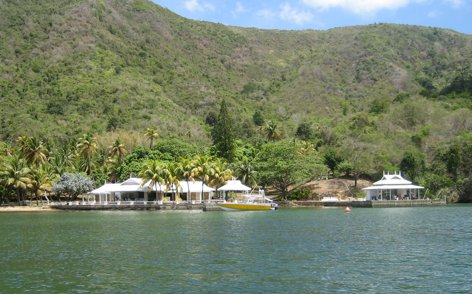
| Just another weekend in Trinidad |
Subscribe to:
Posts (Atom)